DESCRIPTION
We researched and designed a prototype of a medication management system for individuals with mild cognitive impairment (TBI and Alzheimer’s).
MY ROLE + DELIVERABLES
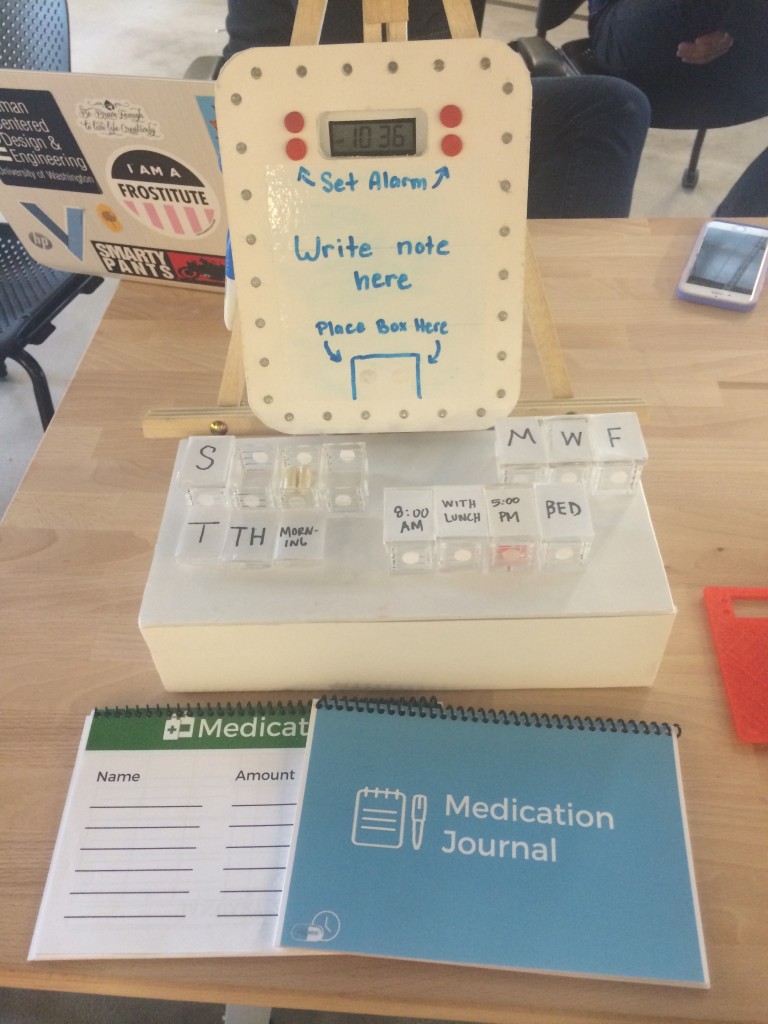
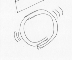
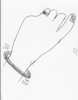
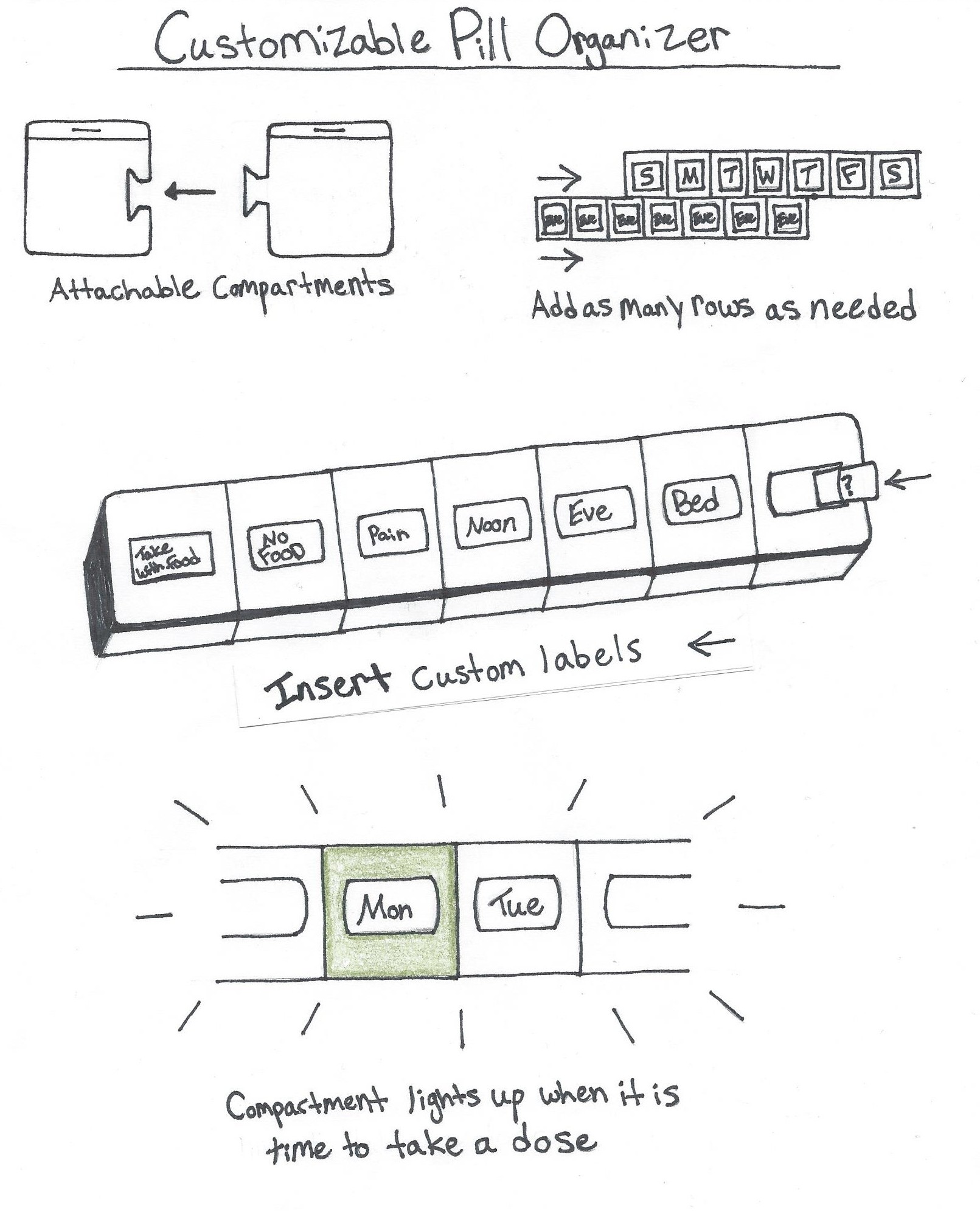
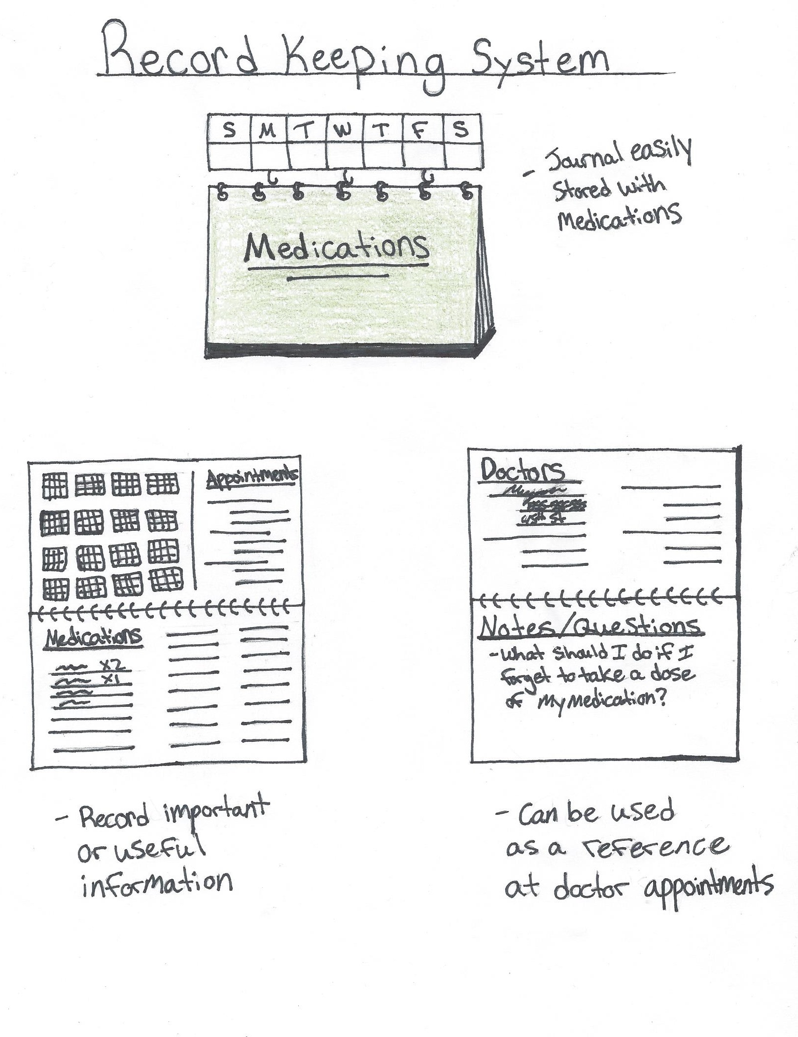
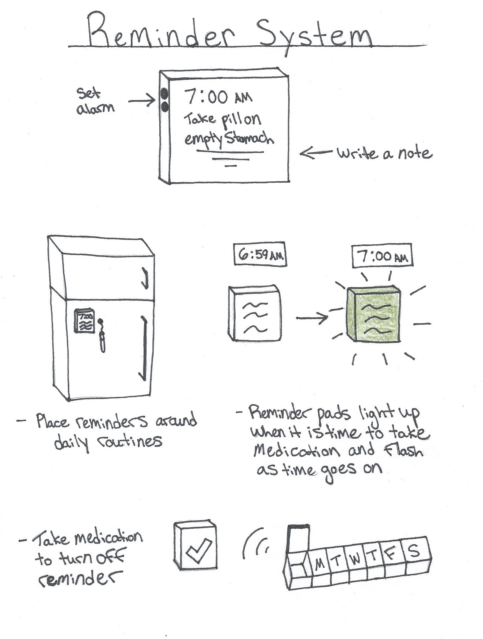
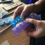
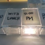
One of four UX Designers on the team. Deliverables included physical prototype of concept which included customizable pill boxes, portable reminder system, and a medication journal.
METHODS
User Research, Contextual Interviews, Subject Matter Expert Interviews, Design Requirements, Personas, Sketching, Usability Testing, Empathy Testing, Rapid Prototyping, 3D Modeling & Printing, Laser Cutting, Silicon Molding, Video Prototyping
TOOLS
iMovie, Adobe Illustrator, Adobe Photoshop, Adobe InDesign, Miscellaneous Craft Supplies, 123 Design, Rhino, Silicon and Plexi Molds
The Problem

Managing medications for medical memory disorders can be difficult and require assistance, oversight, or administration. This oversight can limit the independence of patients and put an unreasonable burden on family and primary care givers.
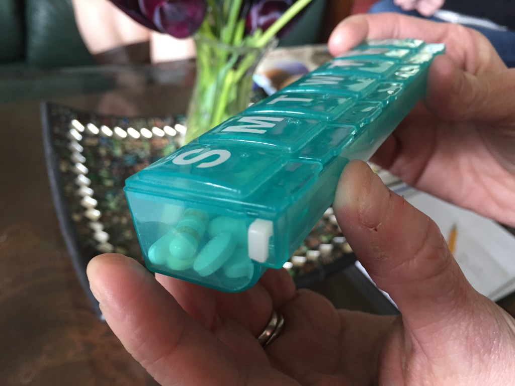
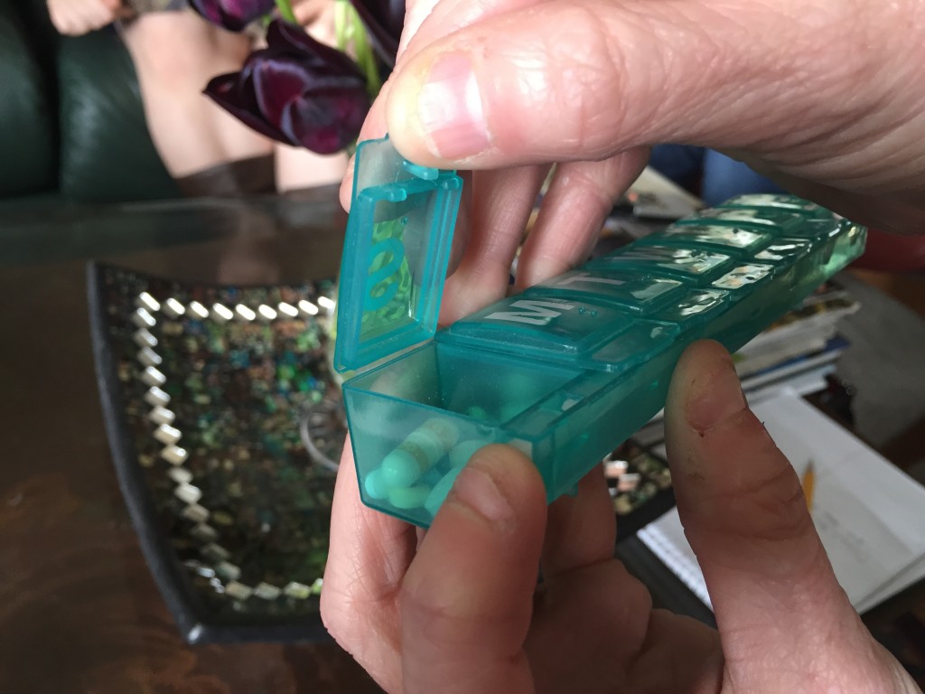
Our motivation for this research stems from a desire to improve the quality of life for people who are impacted by memory loss. We want to create a design solution that can promote independence of individuals with memory loss, ease the burdens of primary caregivers, and provide peace of mind to families who are affected. This project is extremely close to my heart as my Mother-in-Law, pictured to the left, has been diagnosed with Dementia. Finding a solution that could help her and my Father-in-Law was my primary motivation.
 About Alzheimers
47.5 million people live with dementia.
The total number of people with dementia worldwide in 2015 is estimated at 47.5 million. Among them, 58% live in low- and middle-income countries, and this proportion is projected to rise to 71% by 2050. *
A new case of dementia is diagnosed every 4 seconds.
The total number of new cases of dementia each year worldwide is nearly 7.7 million, implying 1 new case every 4 seconds. The number of people with dementia is expected to increase to 75.6 million in 2030 and 135.5 million in 2050.
Huge economic impact; US$ 604 billion per year
The high cost of the disease will challenge health systems to deal with the predicted future increase of cases. The costs are estimated at US$ 604 billion per year at present and are set to increase even more quickly than the prevalence.
Our Solution
Target Users
- Primary: Individuals with medical memory loss including Alzheimer’s and Traumatic Brain Injury (TBI).
- Secondary: The family and caregivers for these individuals.
- Tertiary: Medical professionals monitoring their patient’s health status.
Our final prototype had three elements:
- Reminder System
- Pill Boxes
- Medication Journal
Our Final Prototype
How it works
This video was used for usability testing to demonstrate how the system components interacted with each other.
Our Process
Our three project phases
- Research
- Ideation
- Prototyping
Research
Our research consisted of a brief literature review and user interviews. Our deliverable for this phase where there Personas that reflected the various target users for our concept.
Annotated Bibliography
Entering a broad and complex design space, our team began our research with a short literature review to identify stakeholders and problem areas in the realm of medication management. Carefully weighing time constraints, we collected and read a total of 11 relevant articles. Topics ranged from the needs of dementia patients to the design of effective notifications systems.
Interviews
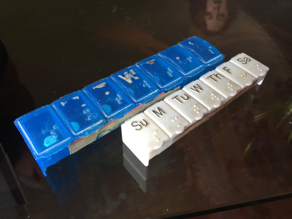
After conducting a literature review, our team identified three primary stakeholders: patients, caregivers and medical professionals. In order to learn more about user needs and perspectives, we reached out to potential participants through email, phone. We were able to schedule in person interviews with a total of five target users. Interviews were conducted in the field over the course of one week.
Participants were as follows:
- Medical professional. A doctor involved with Alzheimer’s and Traumatic Brain Injury research at the Department of Veterans Affairs.
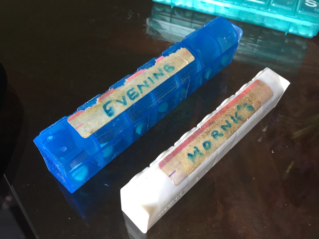
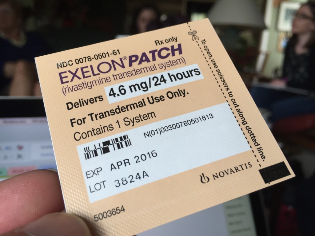
- Dementia patient and her caregiver. An elderly husband and wife team that have been managing dementia for over three years.
- Traumatic Brain Injury patient and his caregiver. A middle aged male whose mother served as a primary caregiver following his accident.
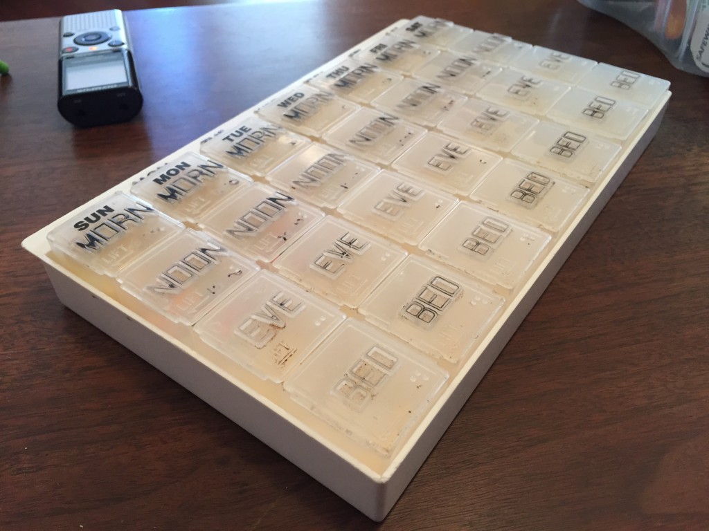
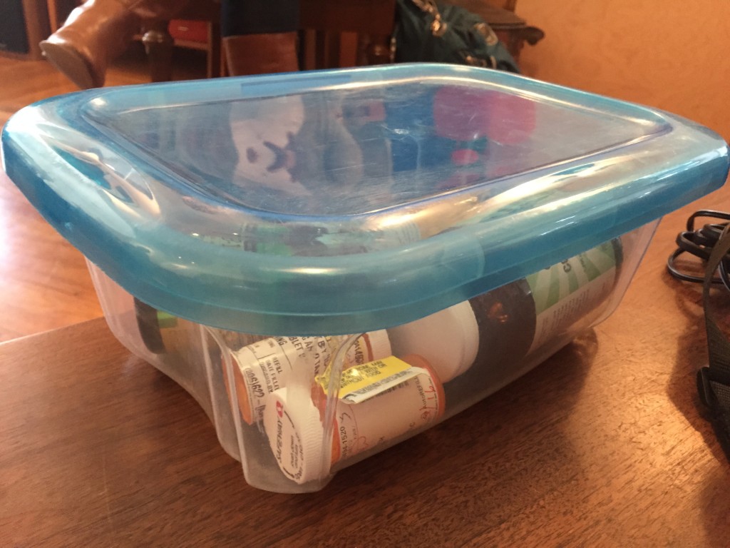
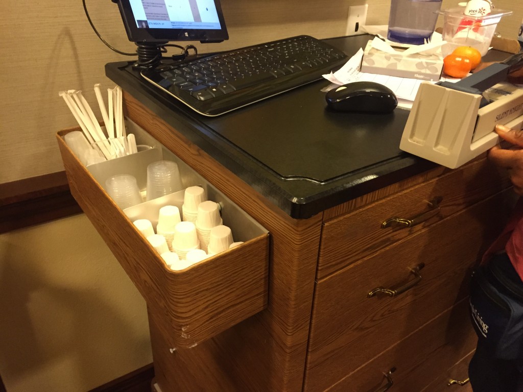
In addition to these formal interviews, our team also visited Aegis, a local assisted living facility with a wing for Alzheimer’s care. During the tour, our team informally interacted with patients, nurses and medication administrators.
Overall, our research allowed us to build understanding and empathy for users needs. We were able to see what methods people were using to manage medication, hear about pain points in their experience and engage participants in the design process. Many users were also eager to describe features that they would like to see in an improved medication management system.
Personas
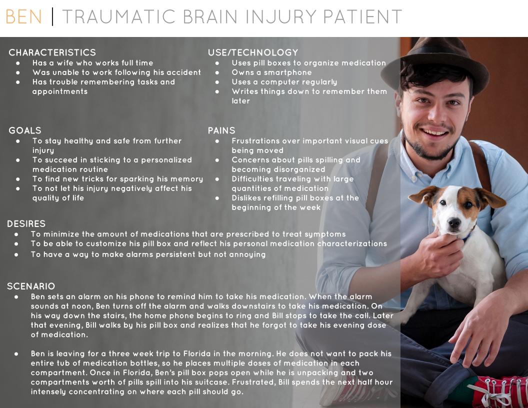
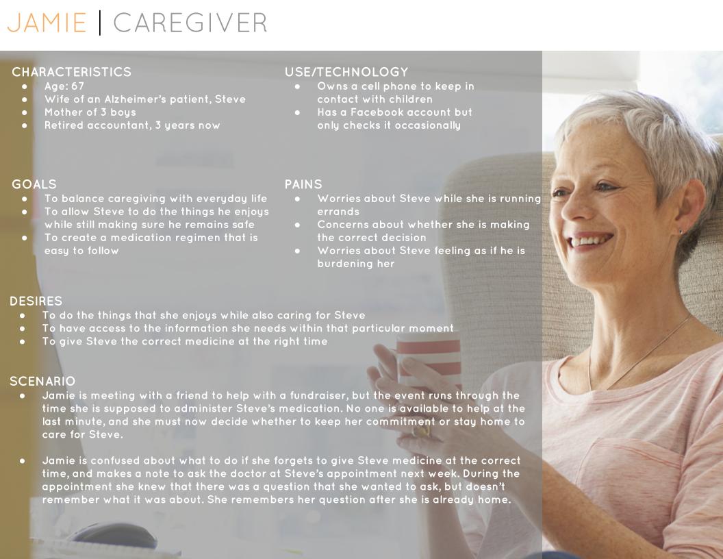
After talking to users and seeing their medication related frustrations first hand, we created three personas to document the wants and needs of our target users. These personas will be internalized and used to guide design during the idealization phase of our project. All information presented in the personas is drawn from our interviews and literature review.
Ideation
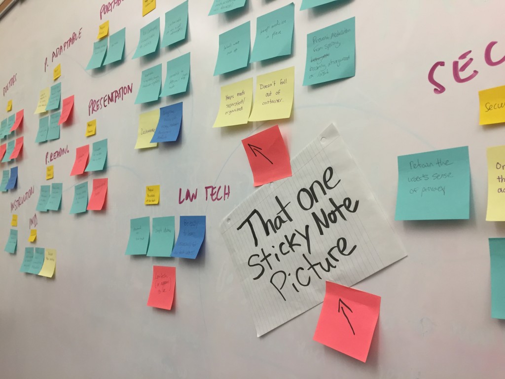
Drawing directly from user research findings, our team compiled a list of design considerations to refer to during ideation. Additionally, we pulled out the most pertinent design considerations and created a top ten design requirements list. By generating ideas that satisfied these design requirements, we ensured that potential products would, indeed, be beneficial to users within our design space.
Design Requirements
Traits of a successful medication management system
- Helps user take the correct medication, at the correct time of day, in the correct dosage
- Easily adapts to changes in medication type, routine, and user preferences
- Has a simple interface that is easy to learn
- Facilitates communication between doctors, patients, and caregivers
- Promotes patient independence while slowing caregiver burnout
- Provides persistent reminders but is not intrusive
- Provides instructions for taking medication and what to do in the event of a user or system error
- Integrates with the user’s existing habits and routines
- Emphasizes accessibility (adheres to standard accessibility guidelines)
- Keeps medication and medical information secure from unauthorized users
Brainstorming
We focused on three areas for our final design considerations:
- Reminders
- Containers
- Organization
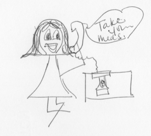
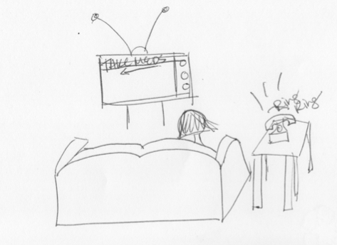
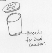
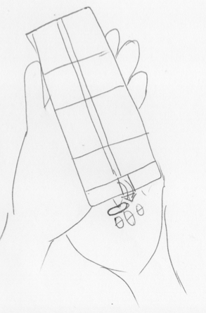
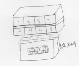
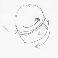
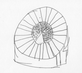
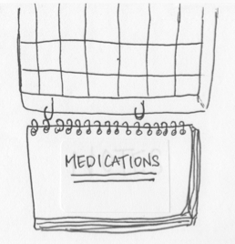
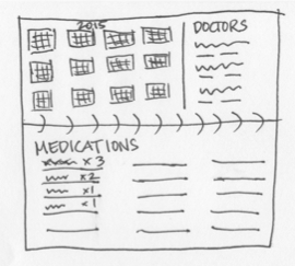
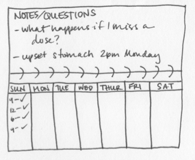
To start off the idea generation process, each team member created several unique sketches of design ideas. These sketches depicted user experiences, user interfaces, and medication management tools. Each sketch was also intended to align with our list of design requirements that was generated after user research. My original sketches can be viewed in the photos below.
Final Sketches
Megan created the final sketches for user testing.
User Feedback on Designs
Record Keeping System
- Consider creating a companion application for tech-savvy users.
- Keep a digital record of when pills are being taken so that doctors can check on adherence rates before altering medication regimens.
- Don’t have too many pages or information will become disorganized.
- Use big spaces with eye catching (colorful) labels.
- Include pictures or icons to minimize time spent reading.
Medication Organization System
- Have a way to find the medi-set (and record book) if it gets lost.
- Make batteries last as long as possible and have an indicator light if they run low.
- Include positive reinforcement (a pill box that says “thank you” when pills are taken).
- Have a way to indicate when refills are needed.
- Have a way to quickly and easily connect with a care manager for medication instructions.
Reminder System
- Utilize stepped feedback (notifications get louder and more frequent).
- Add optional audio feedback.
- Add a feature that allows caretakers to record their voice to help calm users with Alzheimer’s.
- Enable text message notifications (landline calls for the elderly).
- Consider integrating claiming family photos in the background.
Prototyping
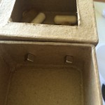
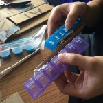
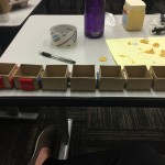
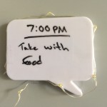
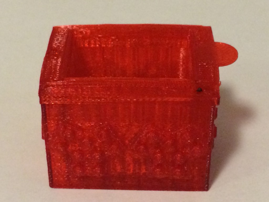
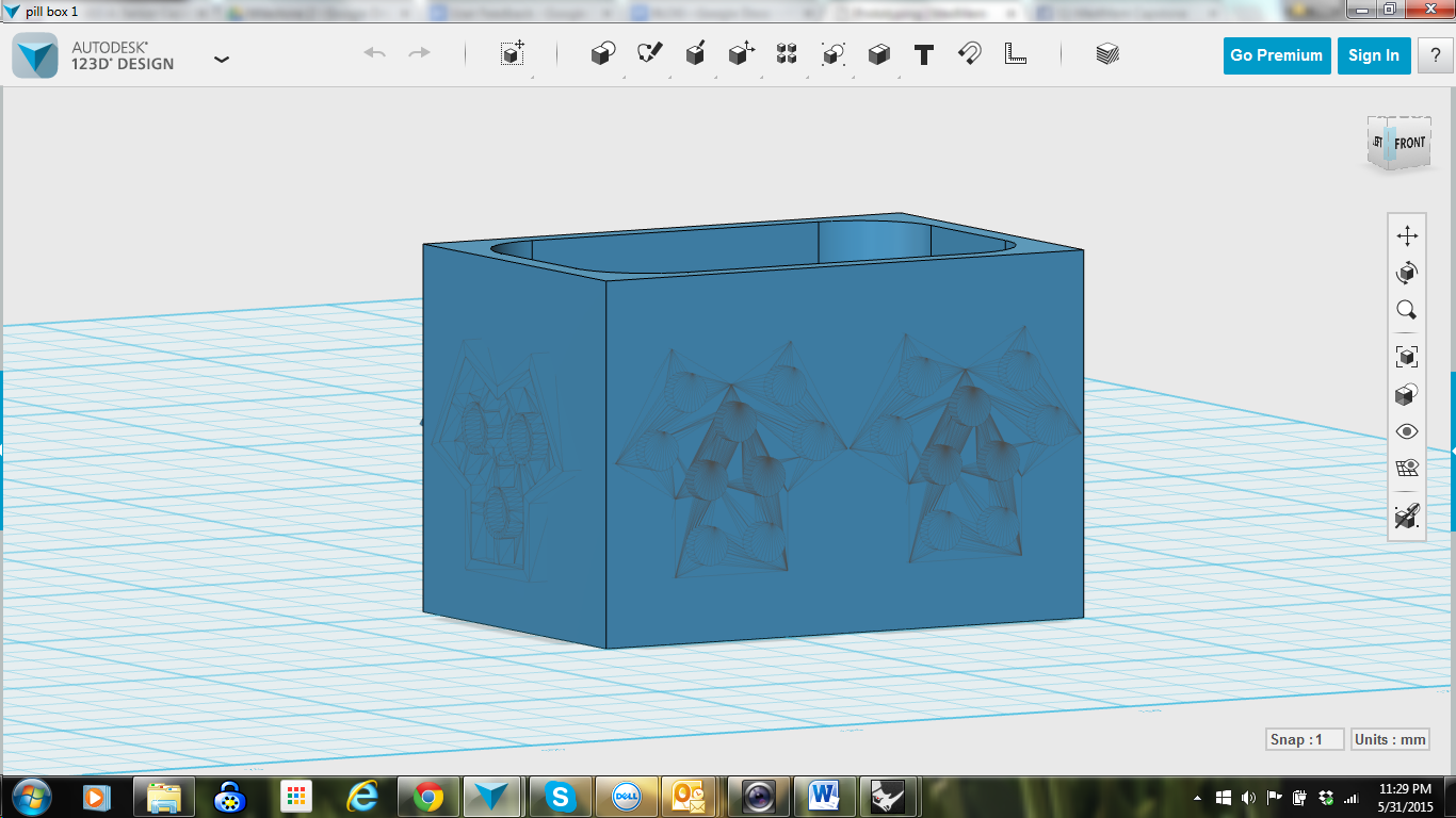
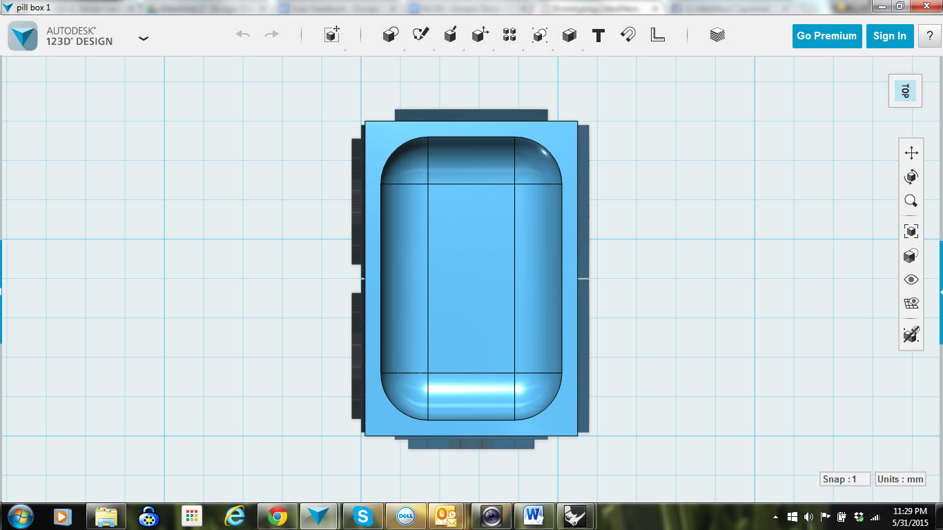
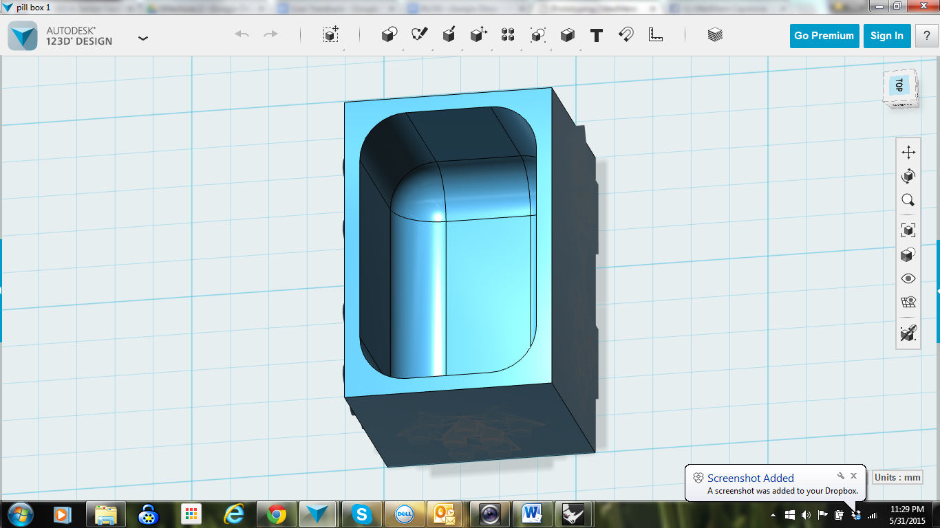
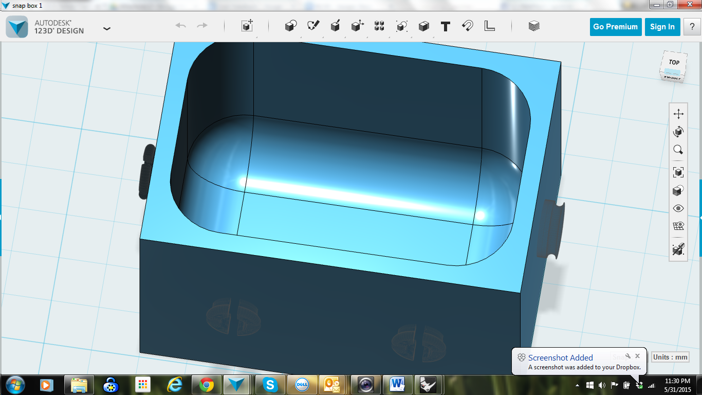
After selecting a final design and clearly sketching it out on paper, it was time to make our ideas tangible. Prototyping allowed us to put our product in the hands of our users as we gathered feedback. We were able to test the feasibility of different form factors, pill box connecting materials, light sources and writing surfaces. Overall, prototyping brought us one step closer to a polished, user friendly product. This phase of our project included a series of rapid prototypes, user feedback and refined prototypes.
Pill Box
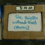
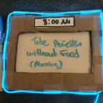
Reminder System
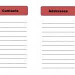
Medication Notebook
Empathy Testing
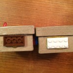
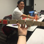
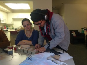
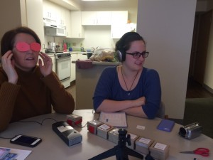
Using gloves, clouded glasses and a distracting soundtrack, we tested our rapid prototypes with consideration for our users who may have reduced sense of touch, vision impairments and/or mild cognitive impairments. This empathy testing allowed us to put ourselves in the shoes of our users and maximize the usability of our design.
Findings
- Lego pieces were the most effective concept for connection
- Small LED on each box was also more visible than the EL wire.
- Testing tools likewise reinforced the importance of maximizing space for labels written in larger text
User Testing
In order to get feedback on our design, we created a video demonstrating how the product works. We then ran focus groups and sent emails to potential users where we explained our product, showed the demo video, and asked questions for feedback. The questions we asked were:
- What, if anything, do you like about this product?
- What, if anything, do you dislike about this product?
- Do you have any suggestions for improving this product?
- Do you see yourself using this in real life? Why or why notDo you think the pillbox, reminder system, and notebook work well together? Why or why not?
We reached out to users from our target audience for feedback. However, in order to maximize the amount of feedback that we received in a very short amount of time, we also reached out to members of a more general audience: anyone who takes at least one medication regularly, regardless of whether they suffer from memory loss.
Overall, participants responded positively to the MedMem system. However, improvements including larger label slips were integrated in our refined prototypes.
Findings
Refined Prototypes
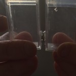
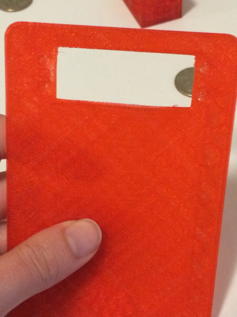
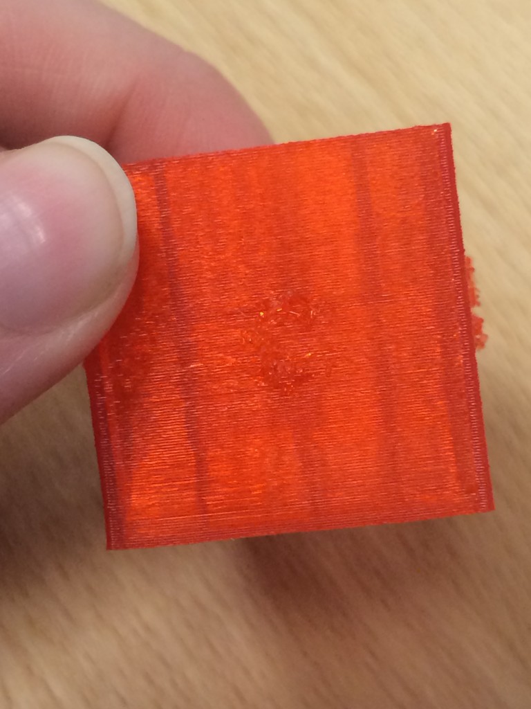
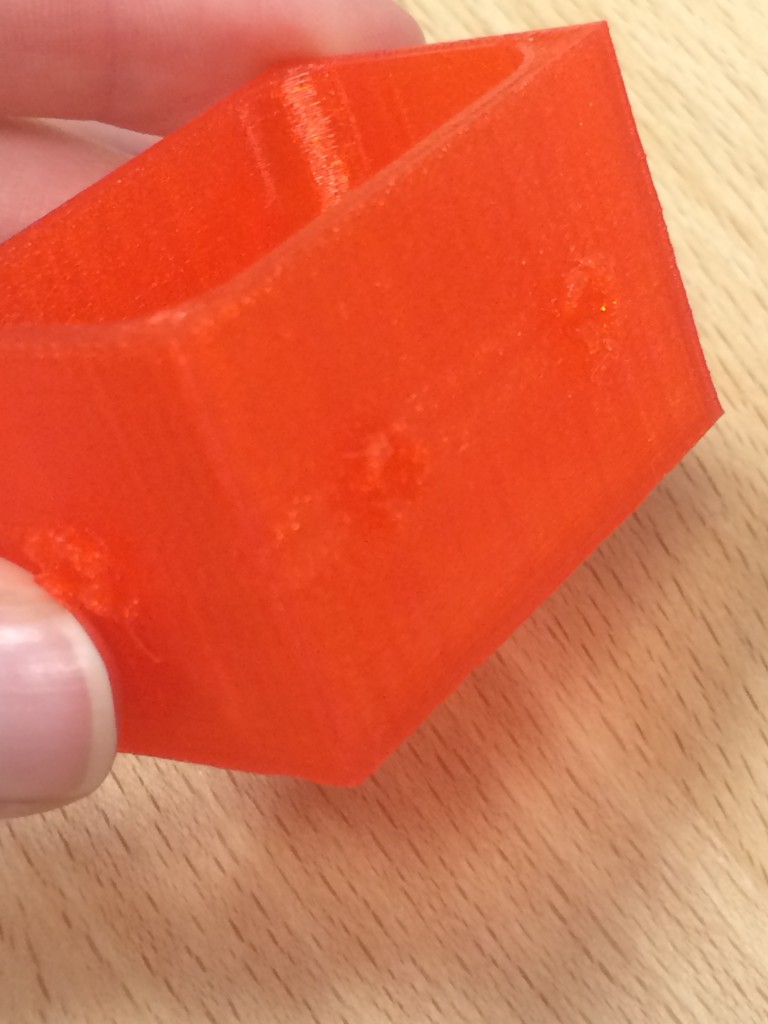
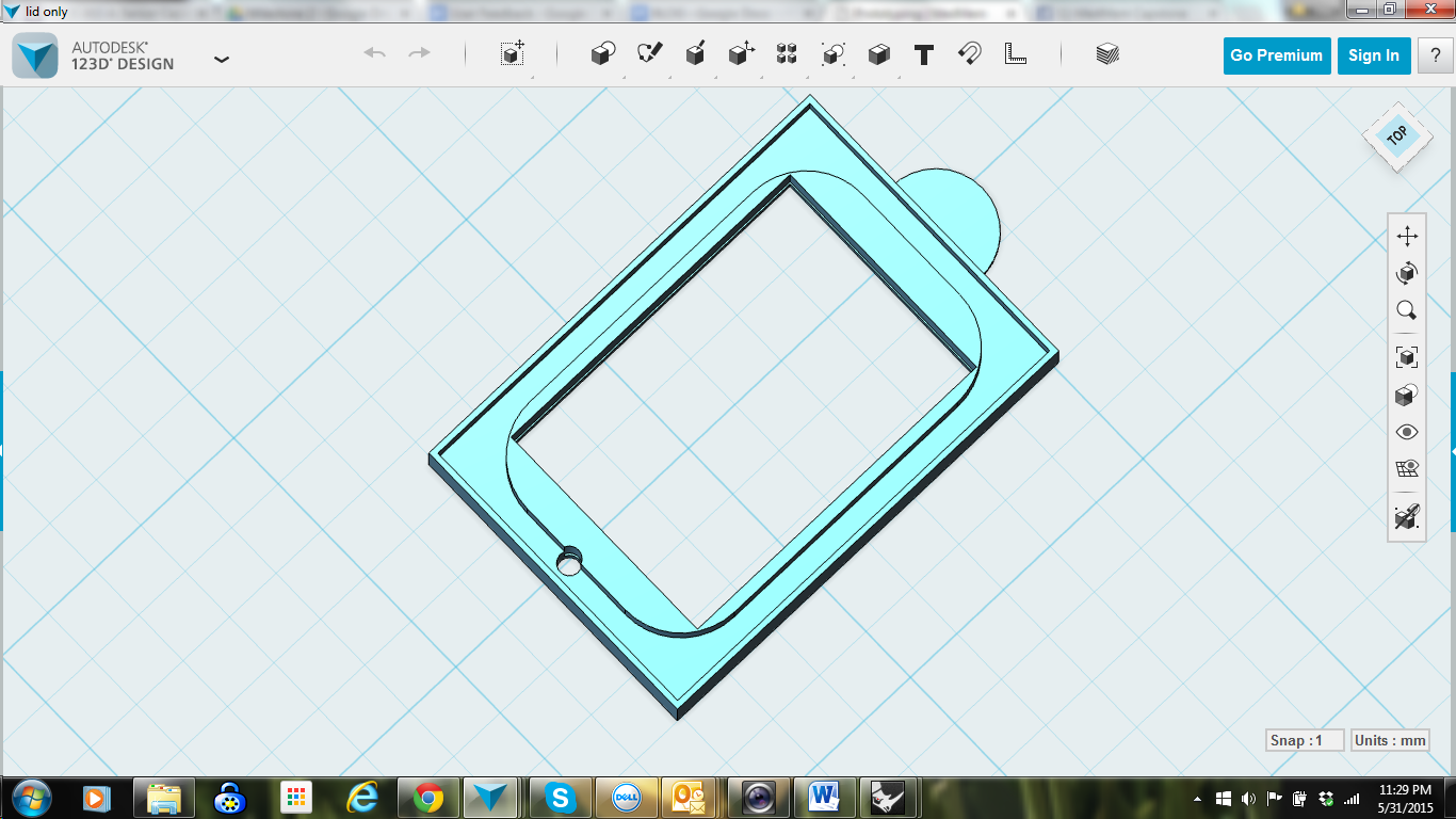
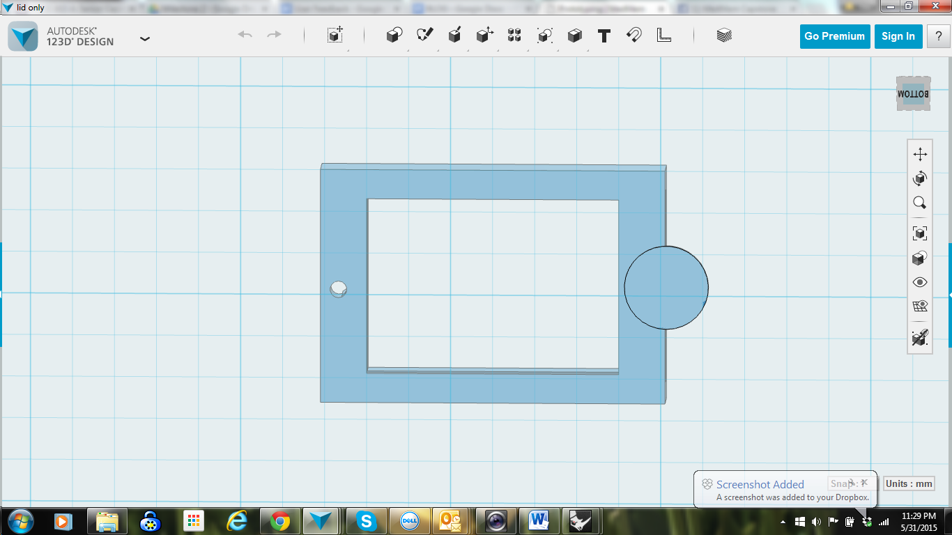
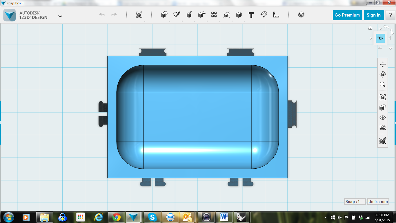
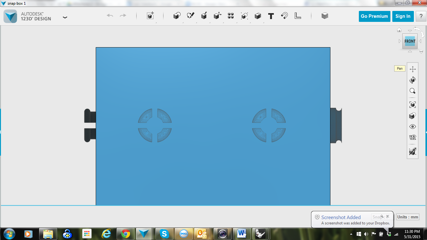
One lesson that we learned while creating refined prototypes is that there is more than one way to convey an idea. Originally, our team decided that 3D printing was ideal modeling our Lego style snap system. Unfortunately, the 3D printers that we had access to were not precise enough for the job. Lids came out the wrong size and the snaps did not fit together. Testing a different snap styles proved more troublesome. The printer was unable to render the finer details of the snap.
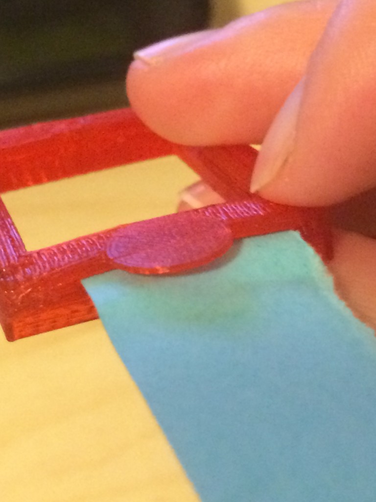
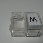
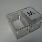
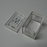
After several failed printing attempts we took a step back and discovered another method to build the pillbox. We laser cut acrylic and built up pill boxes in layers. Instead of our snap design, we added clear Velcro circles to simply convey the idea of connection.
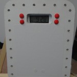
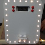
Our reminder system is a laser cut mat board panel mounted on foam and strung with lights. Buttons are made from clay and a small clock is taped into the slot for an LCD screen.
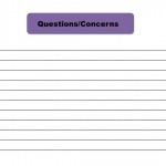
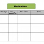
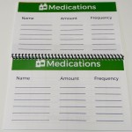
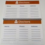
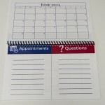
Our medication journal was revised from our original templates. While they are elegantly simple, integrating color and icons improved the visual design from our previous iteration. We had them professionally bound to improve the fidelity and provide a more realistic experience for our users.
Final Presentation Elements
The following element were created for the Capstone Design Showcase.
Poster
Postcards
I created the postcards and t-shirts that were used for the Capstone Expo.
T-shirts
Sources
- http://www.who.int/features/factfiles/dementia/dementia_facts/en/index8.html

